Pouring Ribbons
A dimly-lit, second floor bar was transformed into an airy, colorful space to upend New York City's formula for the cocktail bar. Vintage Gaston Poisson dining chairs, customized industrial stools coupled with operable millwork wall panels and repurposed wrought iron window guards work together to create a unique bar experience. Also successful in an operational sense, New York Times featured the project in an article about ergonomic bar design - a testament to the design team's commitment to their clients in meeting all project goals.
The client came to Dutch East Design with a strong inclination towards color, pattern and texture, as well as some very interesting ideas about finding aesthetic appeal in the functional components of a bar. Designer and client both agreed to break outside of the confines of the speakeasy, despite some members of the ownership team having been pivotal in establishing the recent resurgence in popularity of the New York speakeasy.
The client called for a very specific service model, so in close collaboration with them the space was broken up into different areas of varying levels of activity/energy, all contributing to a well-balanced social space. Entering roughly halfway along the long narrow room, guests can head either towards the respite of the lounge-style seating at one end, or the higher energy theatre of the bar at the other.
On account of being on the second floor, the venue has no basement for storage, so the most had to be made of what little space there is – back bar shelving is deep to provide storage for all back-up spirits, and banquettes and built-in seating double up as dry-goods storage. As for the bar itself, Dutch East Design worked very closely with the client to maximize efficiency of each workstation so that their high standards of product and service could be met.
Interlocking and operable millwork panels line one wall of the entire length of the space. The existing rectangular window was transformed into a wide arch, and the back bar millwork is an elaborate composition of shelves, cupboards and cubby holes.
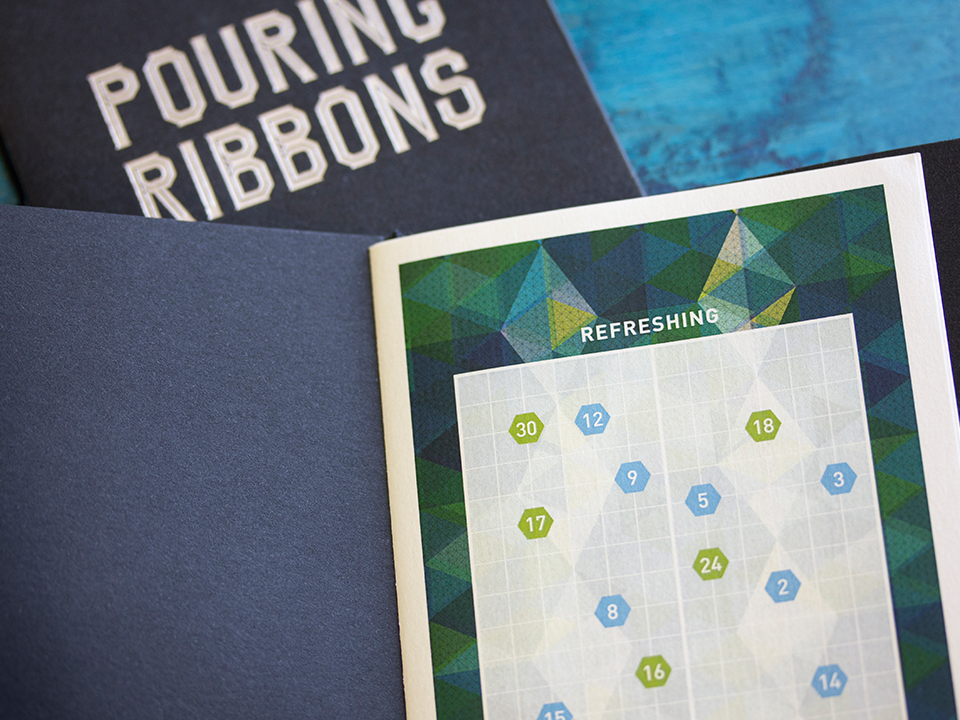
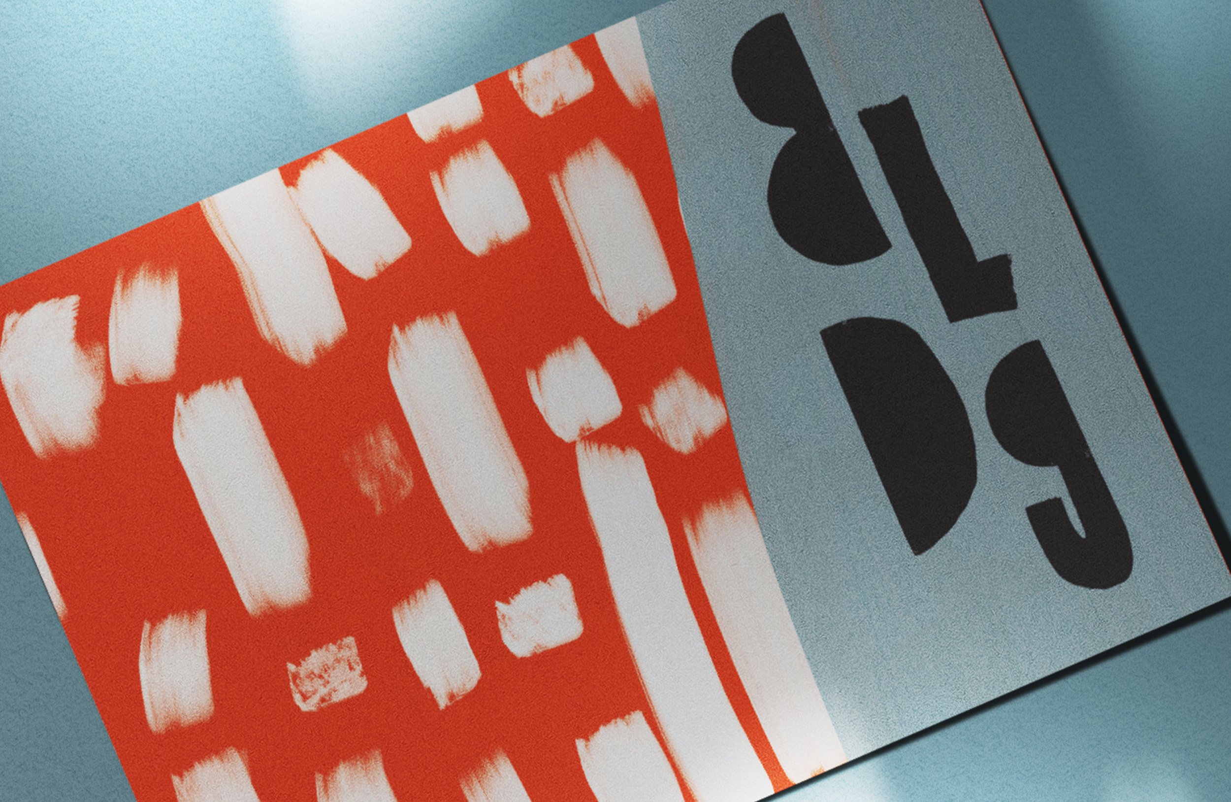
Working hand-in-hand with the interior design, Pouring Ribbons’s graphic identity also celebrates color and pattern. The pattern – which forms part of the logo, and appears throughout the printed collateral – embraces the sense of discovery to be found in the interiors – at first glance it tells one story, but upon closer inspection, the details emerge . The same can be said for the typeface designed for the logo, which is unique to Pouring Ribbons.
Responding to the client’s specific brief, a visual matrix was designed to aide customers in selecting a cocktail. Menus were coordinated with slots in the custom table tops, so that a customer always has a menu on-hand, but without it cluttering up valuable table space. Over the years Dutch East has continued to work with Pouring Ribbons to help evolve their menu, providing redesigns for their seasonal menus.


